75th Anniversary
Anniversary Campaign Mark & Style Guide
Overview
The 75th Anniversary Campaign Mark was the cornerstone of Sacramento State’s milestone year celebration. As the lead designer, I developed a comprehensive visual identity that symbolized the university’s growth and transformation while reinforcing its established brand. This project required strategic thinking, creative direction, and cross-platform consistency, ensuring the mark could adapt seamlessly across digital and print applications.
The Idea
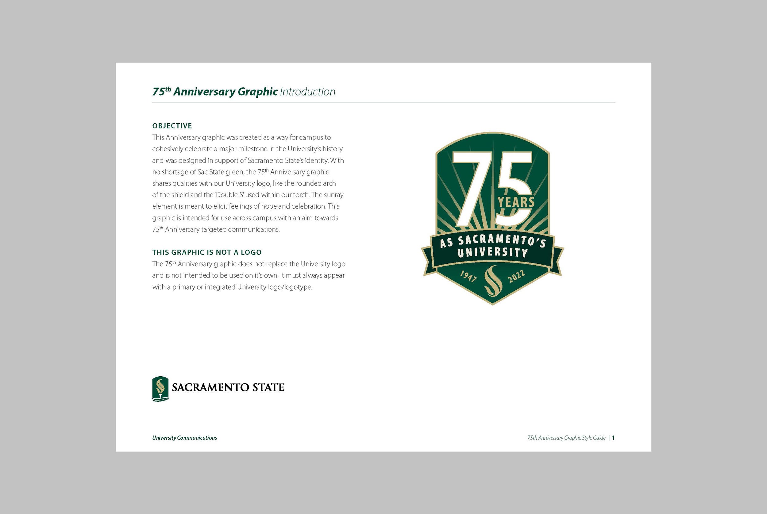
The concept for the 75th Anniversary Campaign Mark centered on themes of growth, continuity, and transformation, reflecting Sacramento State’s journey over the past 75 years. The design balanced tradition with a forward-looking spirit, celebrating the university’s history while embracing its future.
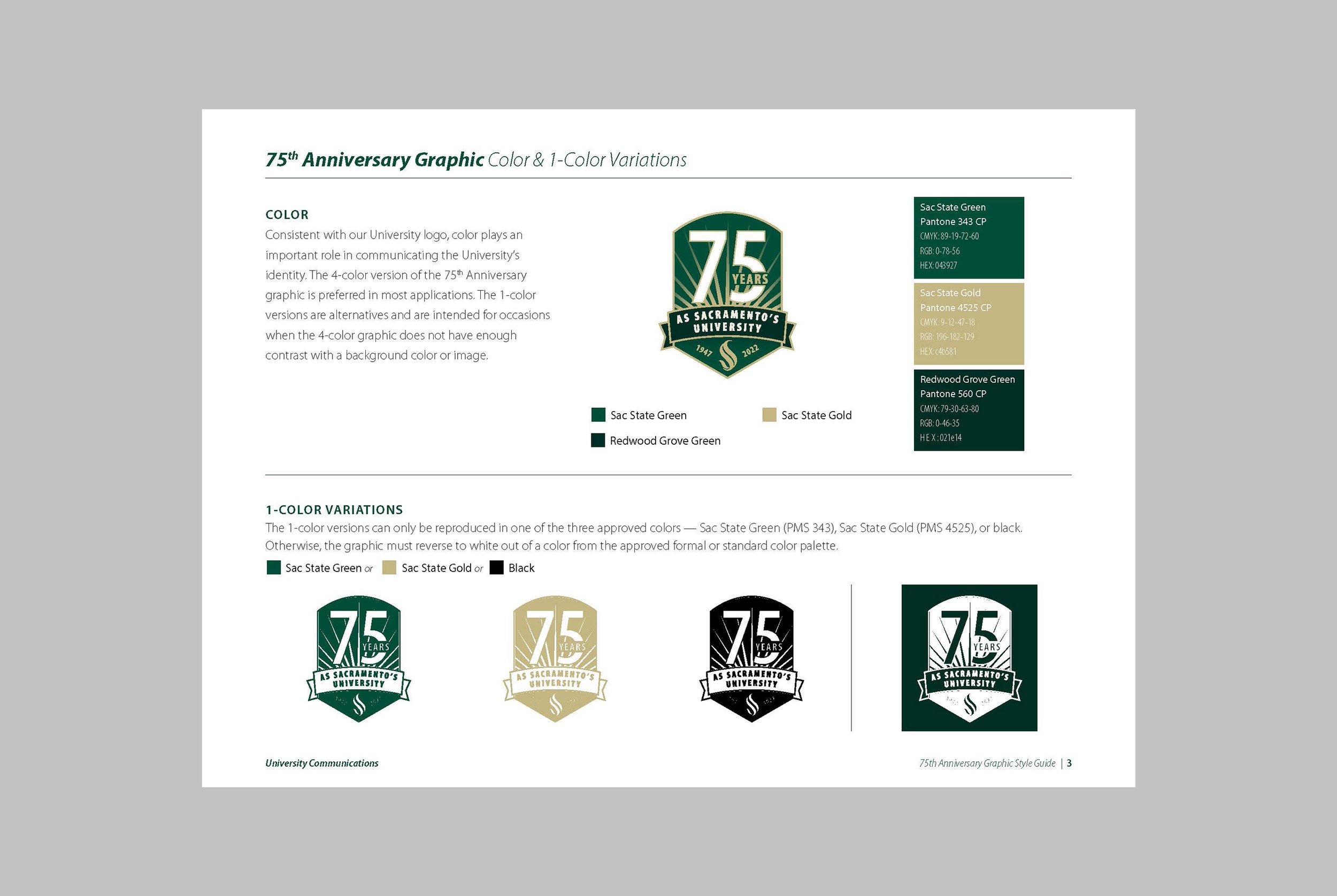
Grounded in Sacramento State’s established visual identity, I incorporated key brand elements, such as the signature green and gold color palette and the top curve of the university’s shield logo, while introducing celebratory accents like metallic gold to symbolize prestige and importance. Research into the university’s past campaigns and values shaped the solution, ensuring the mark resonated with both internal stakeholders and the broader community.
The Process
The design process began with extensive research and concept development.
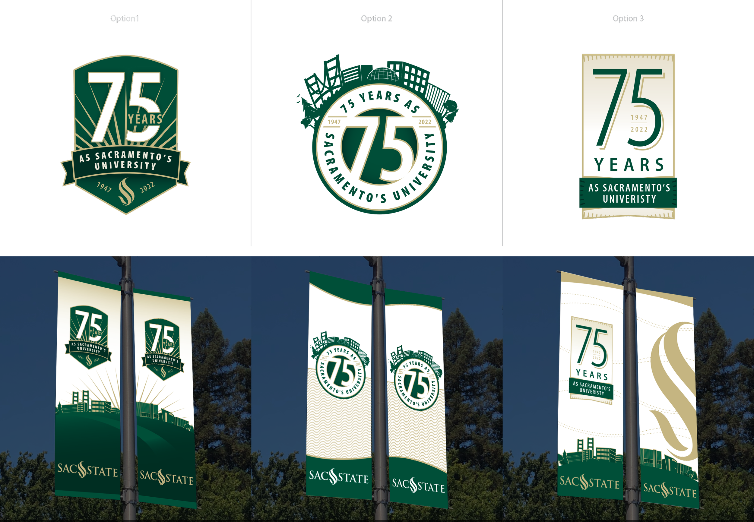
I explored multiple visual interpretations, including:
A bold, modern take emphasizing momentum and growth.
A traditional design rooted in heritage, leveraging elements of the university logo.
A minimalist approach focusing on clean, geometric forms.
These concepts were presented to anniversary committee stakeholders, and through an iterative feedback process, we refined the design into a dynamic “75” mark that conveyed both energy and sophistication. The inclusion of the shield curve subtly tied the design to Sacramento State’s core identity while maintaining a fresh, celebratory tone.
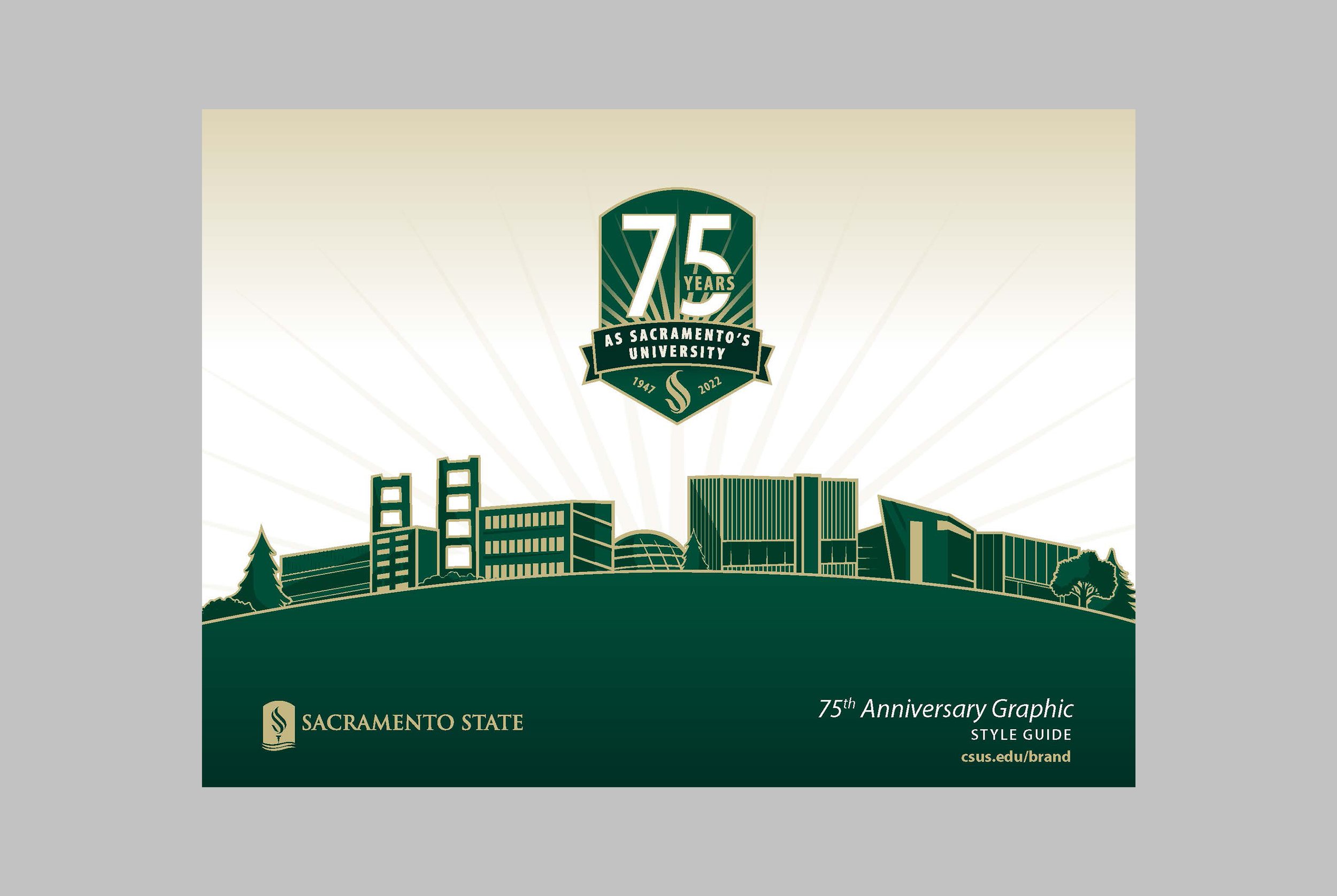
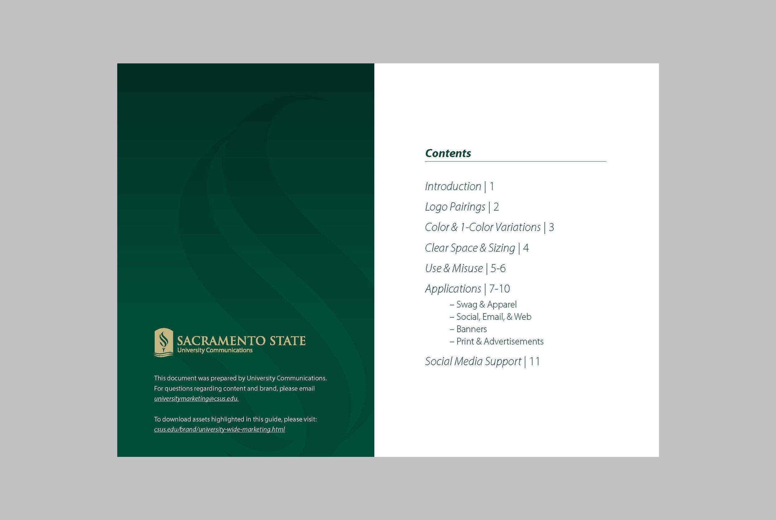
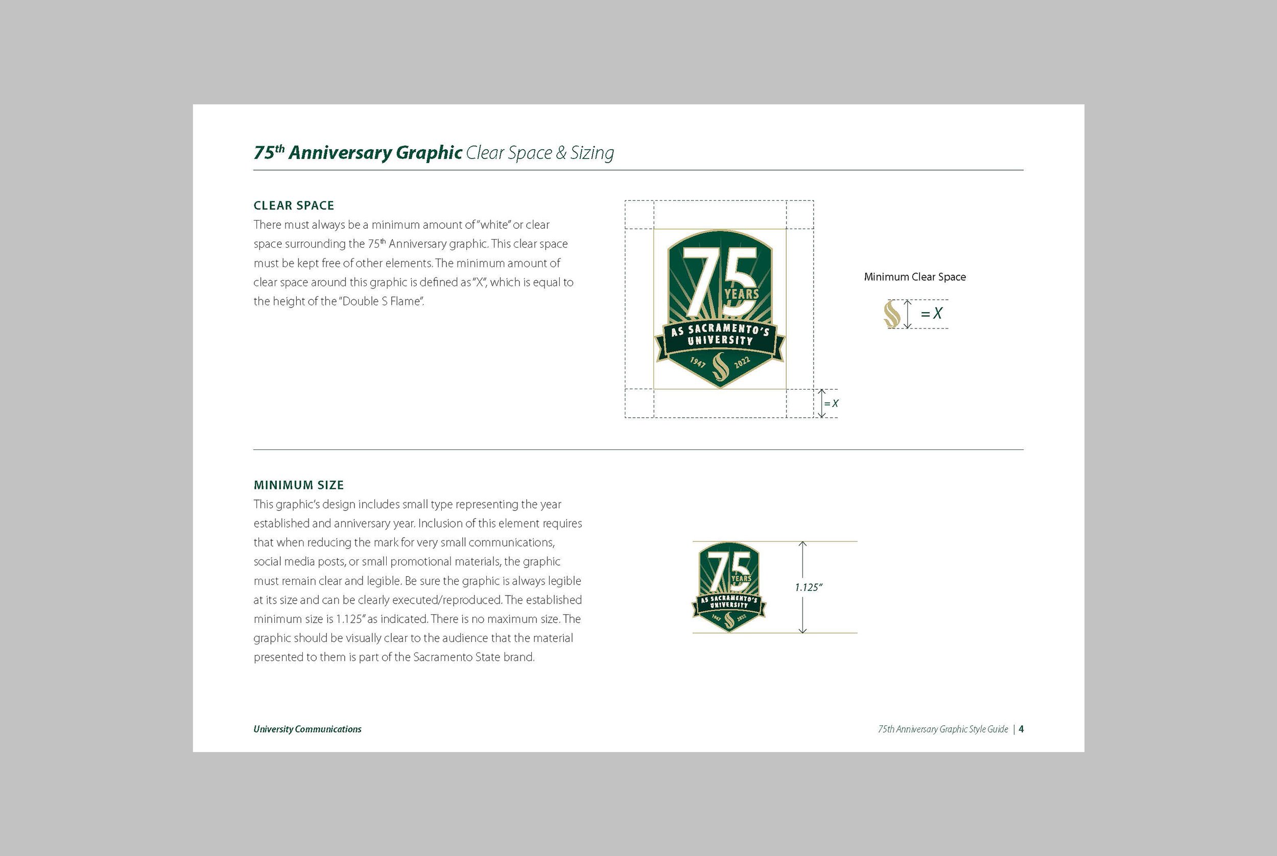
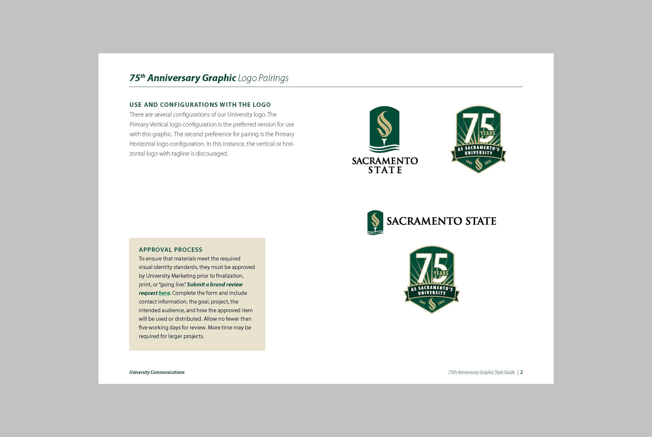
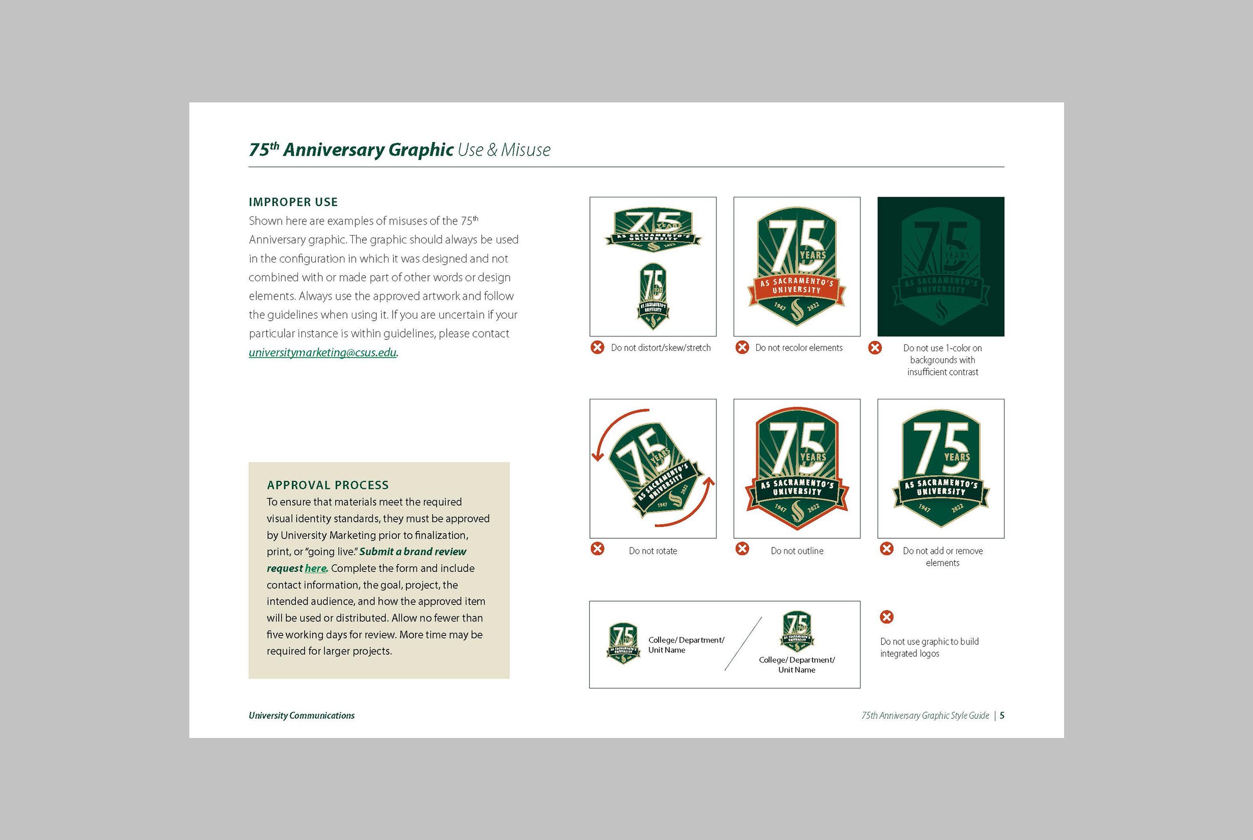
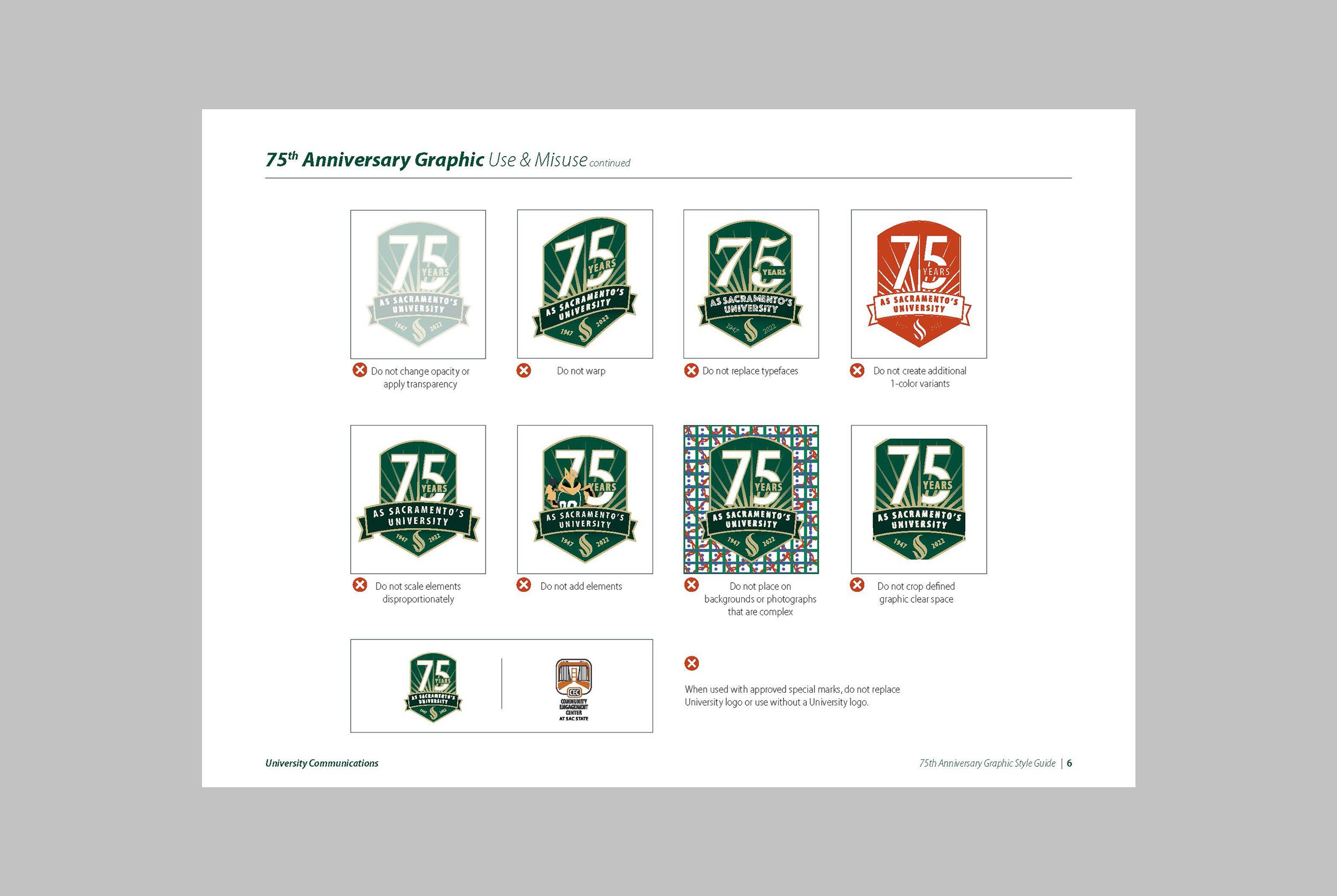
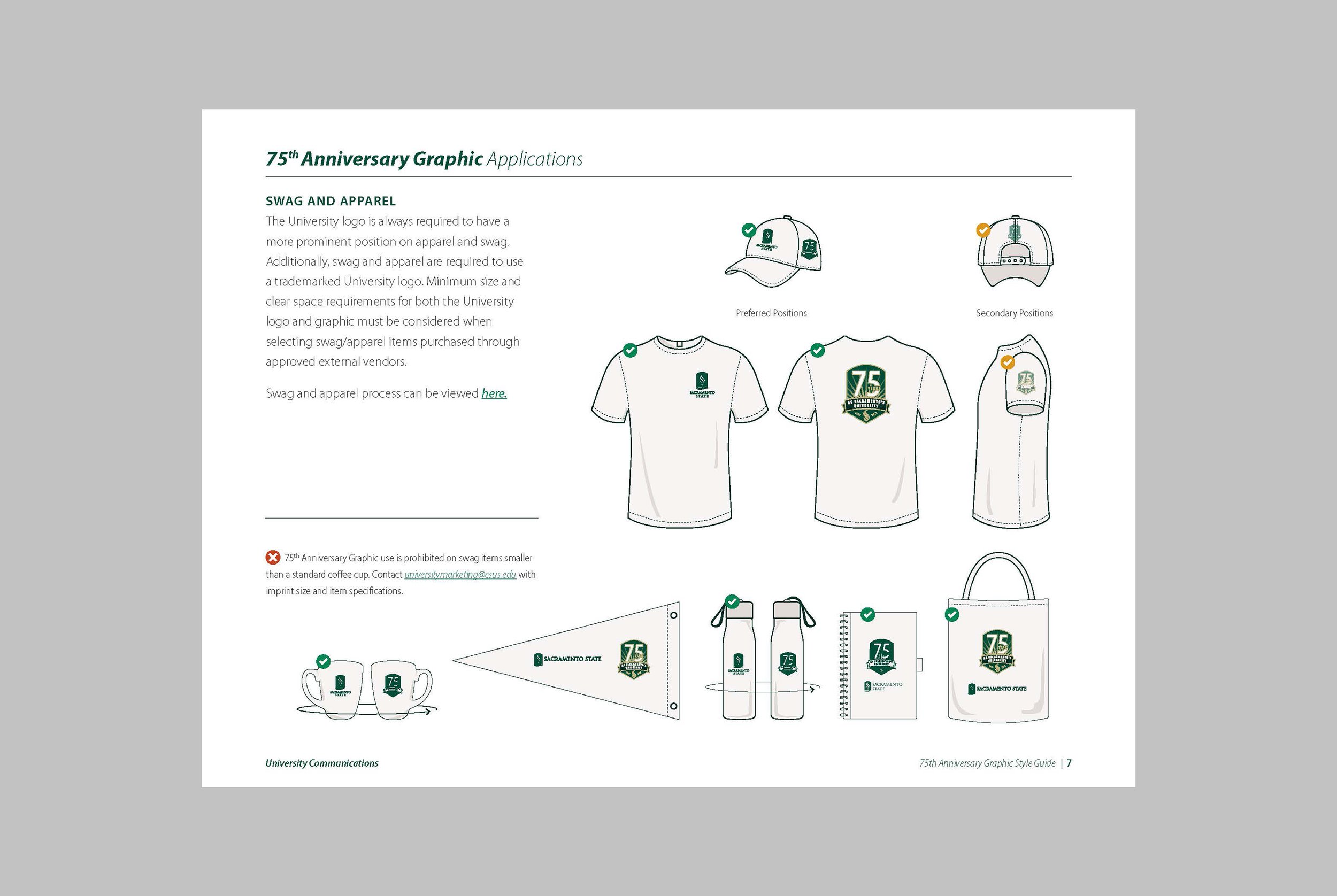
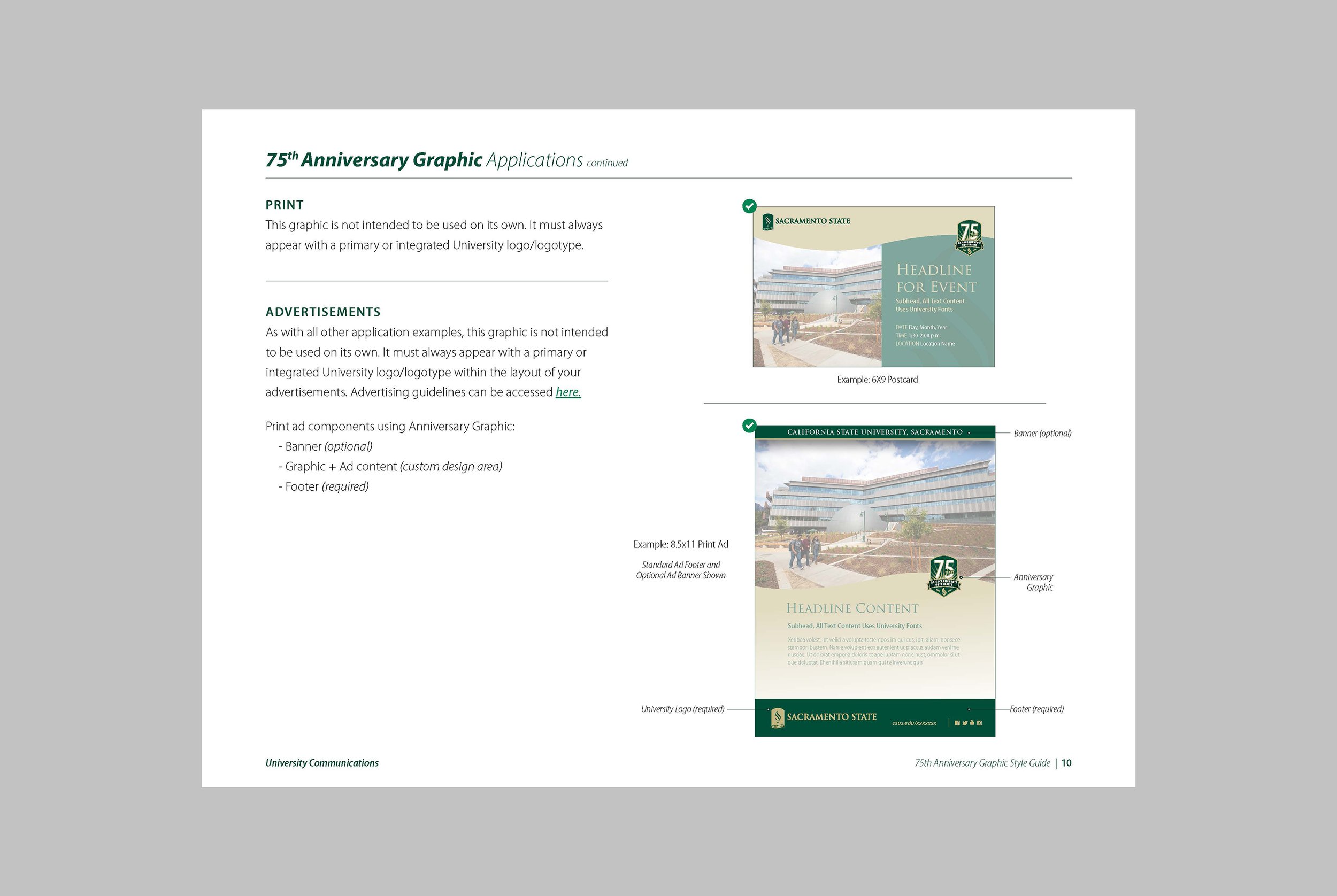
To ensure consistency across all campaign applications, I created a detailed style guide outlining proper usage of the mark, including color applications, typography, scaling, and spacing. This guide also included templates for promotional materials to streamline design across departments and vendors.
Applications
The 75th Anniversary Campaign Mark was applied across a wide range of materials, showcasing its versatility and impact:
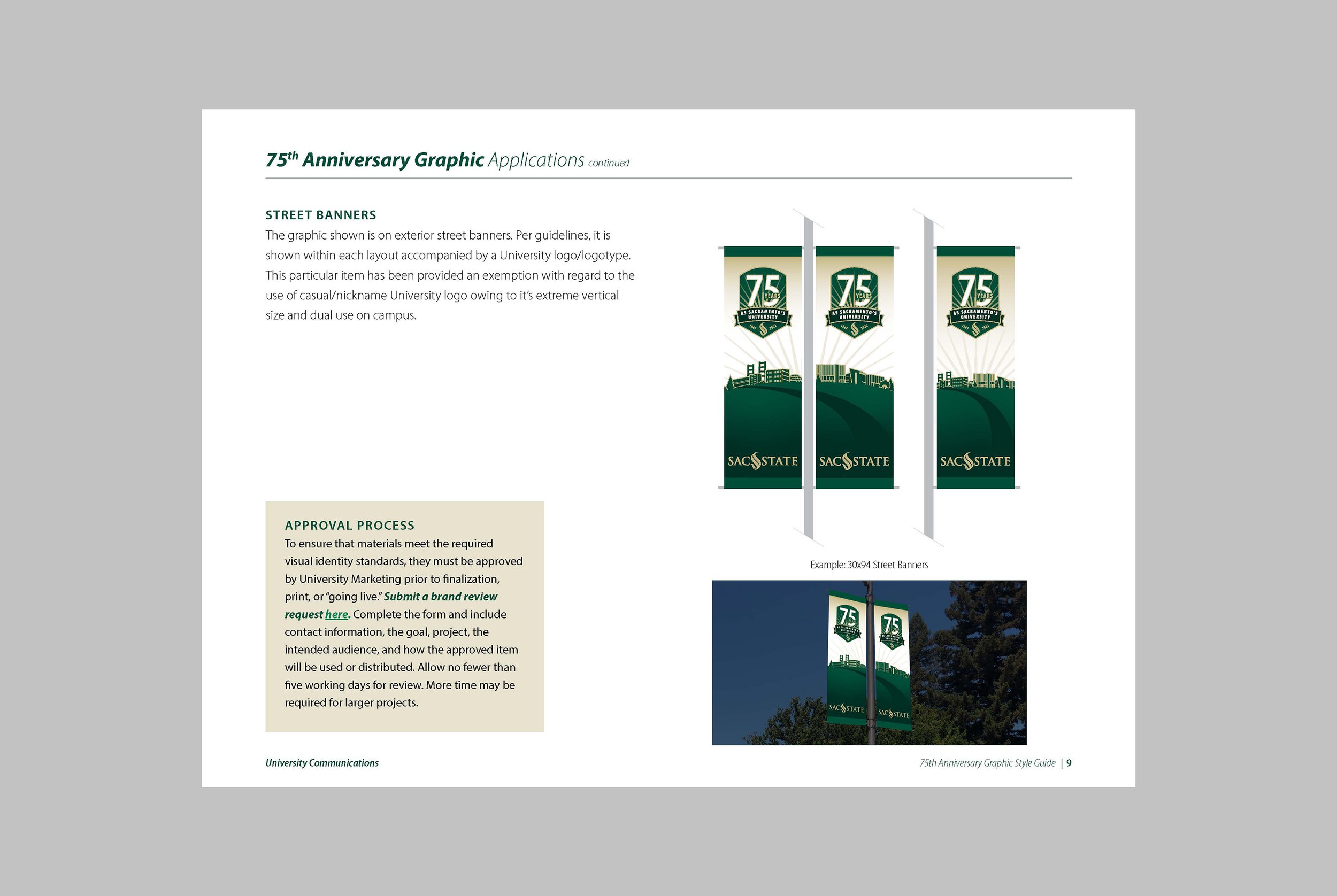
Street Banners: Prominently displayed on and around campus in various sizes, celebrating the milestone with students, faculty, and the community.
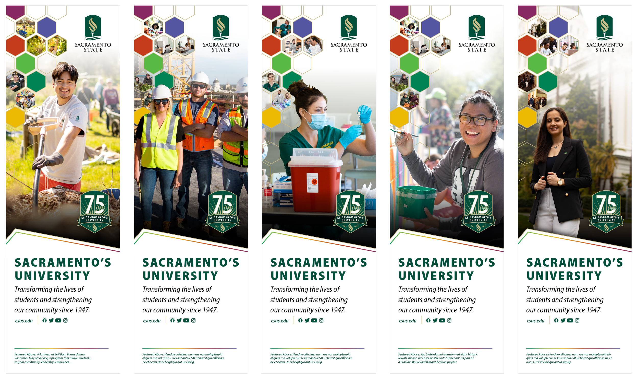
Airport Column Banners: Large-scale installations at Sacramento International Airport positioned Sacramento State as a regional anchor institution and highlighted its 75-year legacy.
Event Materials:
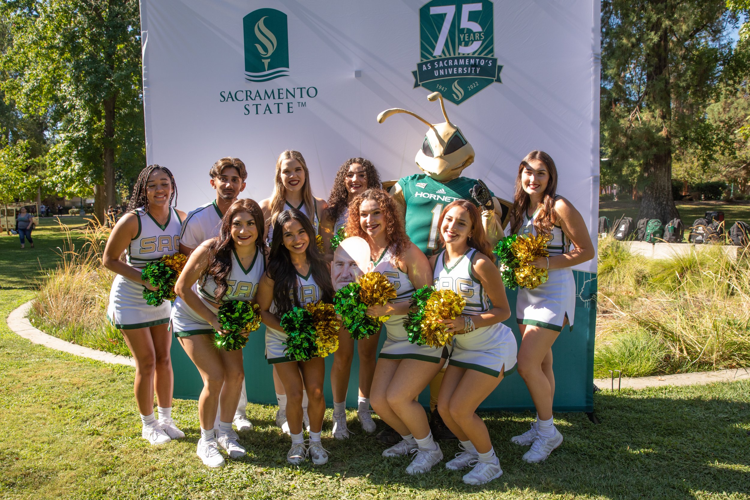
Photo Backdrop: Designed for media and event attendees, combining the mark with engaging visual elements.
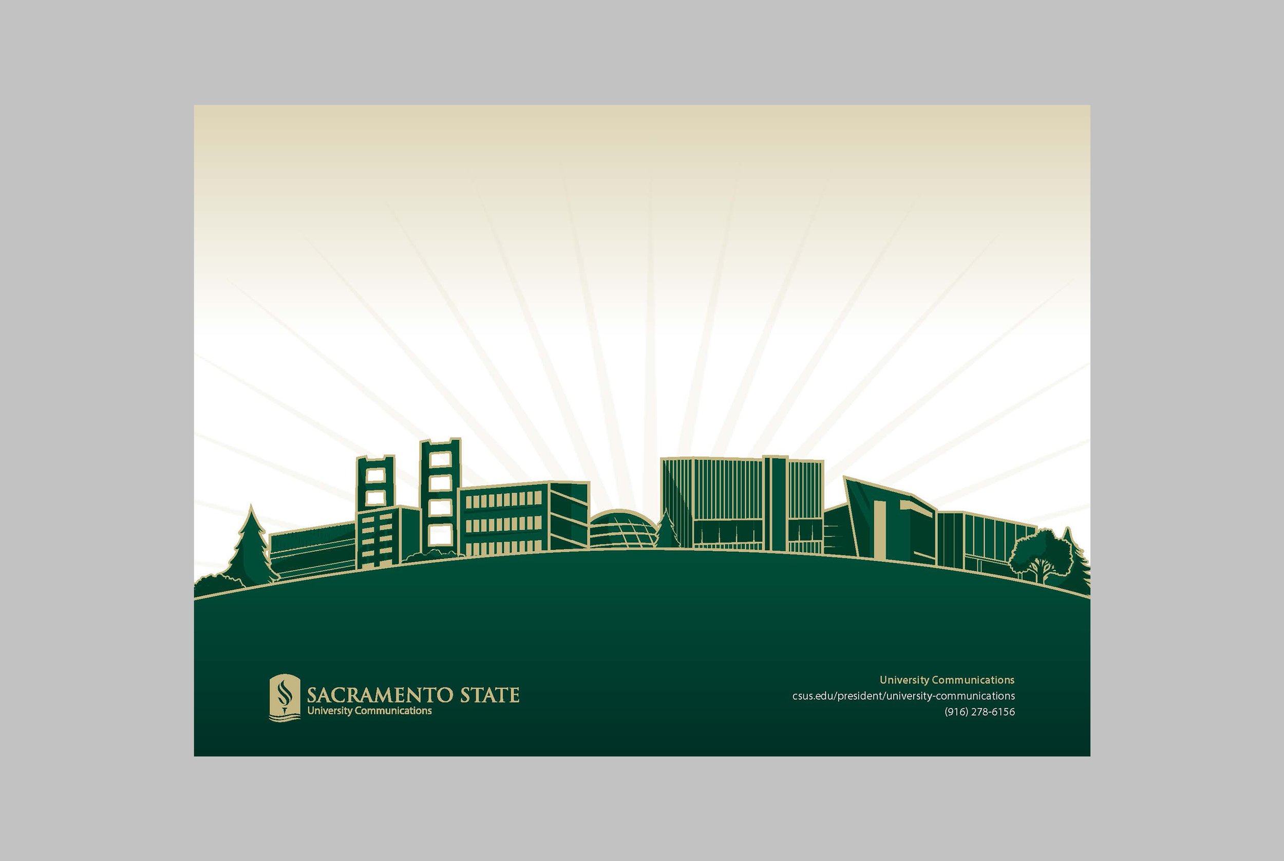
Tabletop Display Banners: Portable banners for campus events and donor functions maintained consistent branding.Press Folder: A polished tool for distributing event information and materials to media.
Swag & Bookstore Displays: In collaboration with the Hornet Bookstore, the mark was featured on swag and apparel, alongside a dedicated in-store display to engage students, alumni, and visitors.
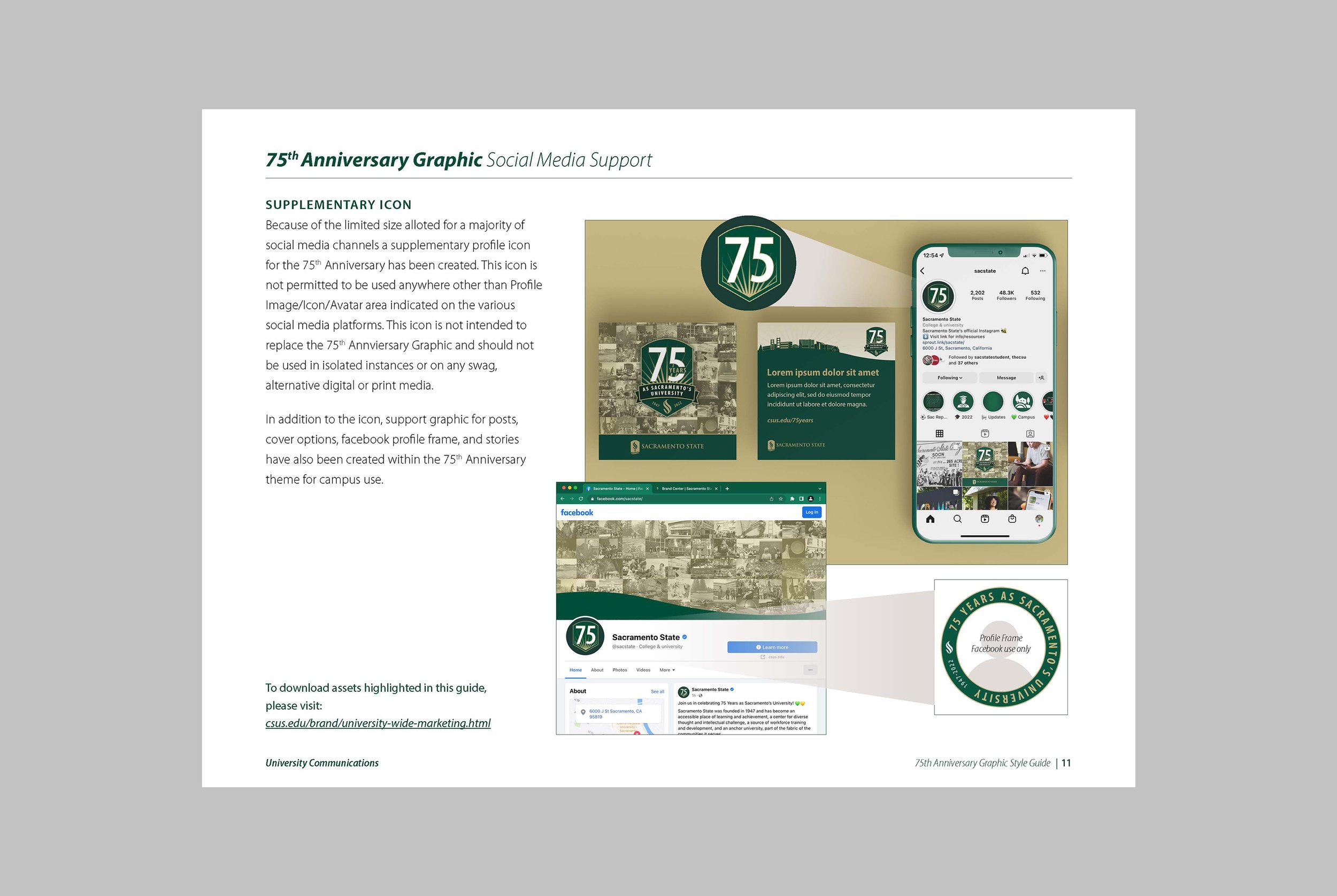
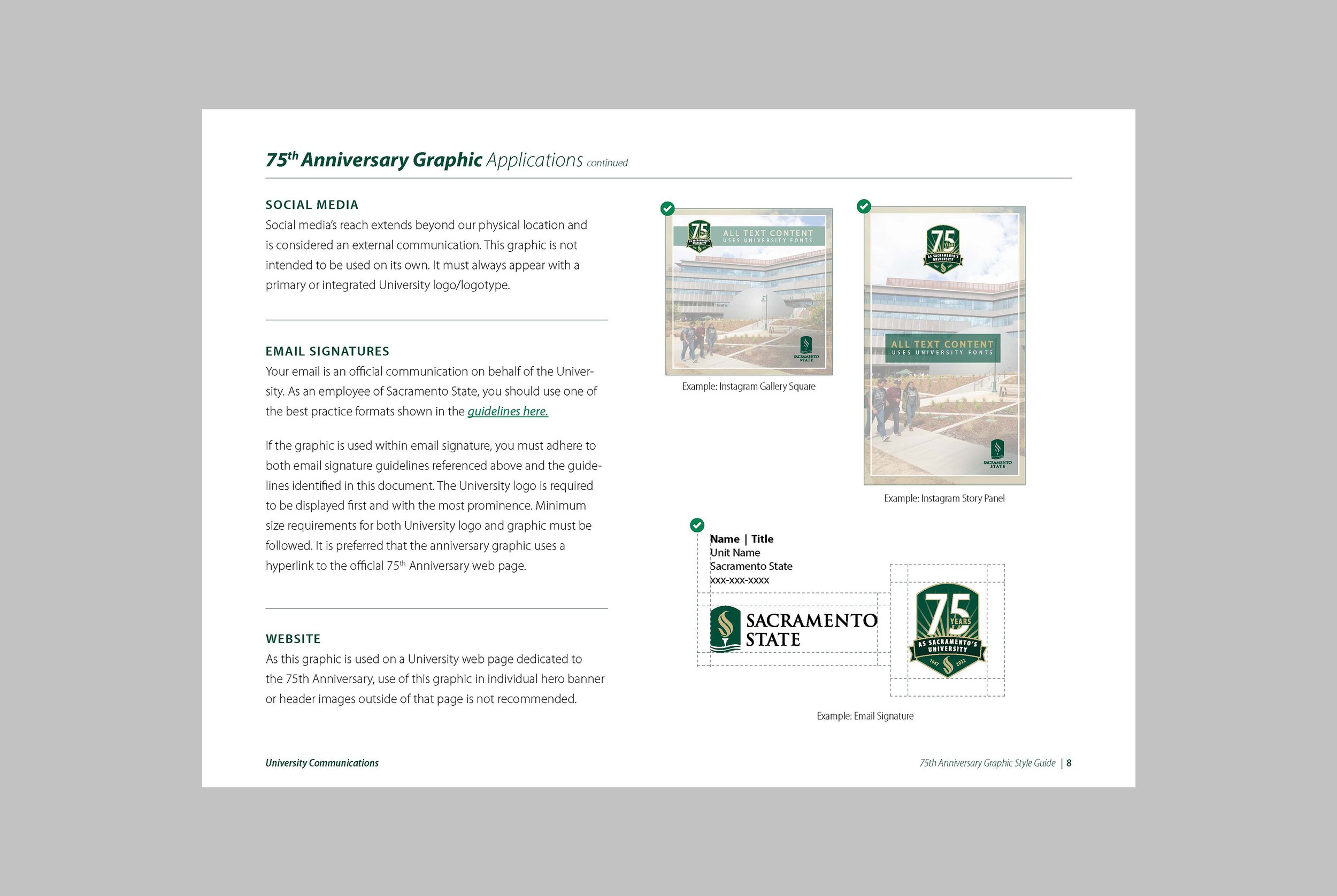
Digital Platforms: Adaptations for Zoom backgrounds, website headers, and social media templates ensured consistent branding across online platforms.
Each application adhered to the style guide, ensuring visual harmony and reinforcing the university’s brand identity across all touchpoints.
Reflection
The 75th Anniversary Campaign Mark exemplifies my ability to lead large-scale branding projects that require both strategic foresight and creative direction. This project reinforced my strengths in:
Strategic Design: Balancing innovation with brand consistency to meet diverse campaign needs.
Cross-Platform Consistency: Developing adaptable assets for digital and physical platforms.
Collaborative Problem-Solving: Incorporating stakeholder feedback to refine the final design.
The success of this campaign underscored the importance of combining tradition and innovation in branding. While the mark will not be reused, its integration of brand elements—such as the shield curve—offers inspiration for future visual identity projects, ensuring continuity as Sacramento State evolves.
This project not only celebrated a major milestone but also demonstrated the impact of thoughtful design in reinforcing institutional values and community pride. Moving forward, I’m excited to apply these skills to leadership roles where I can drive impactful, brand-aligned creative strategies.


