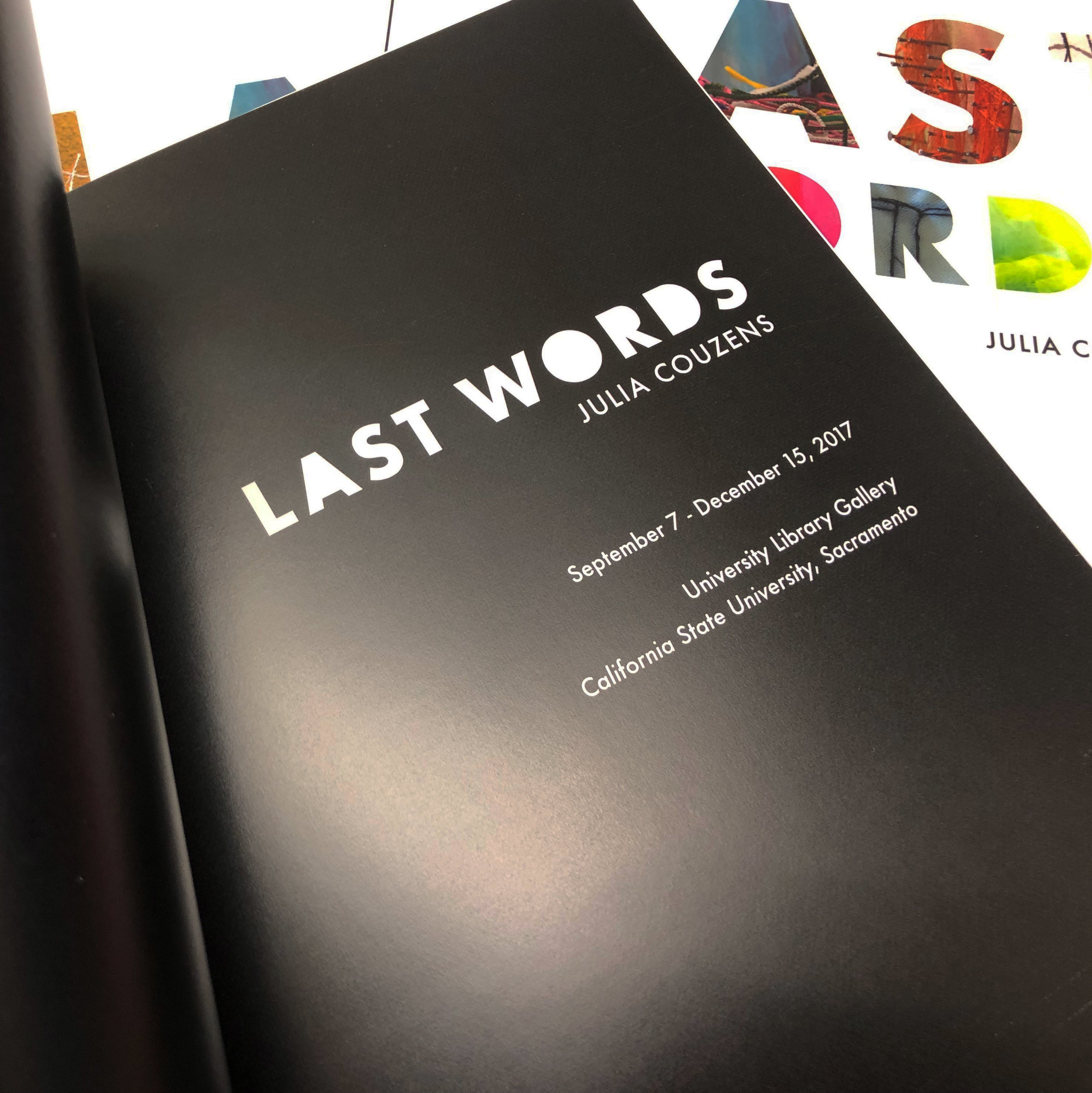
LAST WORDS
Art Catalogue and Cover Design
Project Overview
LAST WORDS, the solo exhibition by artist Julia Couzens, explores the poignant, often surprising final words of deceased individuals—some humorous, others tragic, and all deeply thought-provoking. The exhibition was an emotionally impactful experience for me as a designer, and working directly with Julia Couzens on the creation of the corresponding art catalogue remains one of my most rewarding projects.
From the very first walk-through of the gallery space to our initial creative brief, it was clear that the design of the catalogue had to reflect not only the visual language of the exhibition but also the emotional depth and tactile qualities of the work. I was given a generous amount of creative liberty, and I aimed to infuse every design decision with the same complexity and thoughtfulness that Julia’s art conveyed.
Design Concept & Execution
The LAST WORDS exhibition is marked by an intricate interplay of light, shadow, and texture—qualities that I sought to mirror in the catalogue’s design. The choice of a soft-touch laminate on the cover was a key decision, intended to evoke the tactile experience of fabric or a familiar, worn-in textile. This choice was deeply aligned with the ephemeral nature of the exhibition’s themes, adding a layer of sensory engagement to the viewer’s experience of the book.
For the cover typography, I wanted the title LAST WORDS to suggest the texture of the materials used in the artist’s work. The letterforms themselves are carefully crafted to offer subtle glimpses into the textures, drawing the viewer into the complex narratives of the piece. The minimalist black-and-white design was chosen to reflect the exhibition’s elegant yet stark contrasts of light and dark, while ensuring that the images of the artwork were the focal point.
The layout itself follows a clean, contemporary approach. I selected Futura and its extended font family for the copy because of its geometric clarity and modern aesthetic. Futura’s precision is a fitting juxtaposition to the more organic, hand-crafted elements seen in the exhibition’s photography. The catalogue is presented much like a portfolio, with large full-page spreads for impactful visuals and smaller half-page layouts for close-up details, allowing for an immersive exploration of the artist’s work.
Catalogue Details:
Size: 8 x 10 inches, Perfect Bound
Quantity Produced: 250 copies
Printing Process: 4/4 (Full Color)
Paper Stock: 80# Mohawk Everyday Digital Silk Cover
Printing Equipment: Indigo 5500
Specialty Finishes: Soft-Touch Lamination
A Personal Reflection
Working on LAST WORDS was not only an exercise in design but an exploration of the profound impact art can have on the viewer. The catalogue became more than just a documentation of an exhibition; it was an extension of the work itself—a tactile experience that allowed the viewer to feel the themes of the exhibition in their hands. This project remains one of the most interesting and inspiring undertakings in my career, and I am deeply proud of how the design reflects Julia Couzens’ powerful vision.


